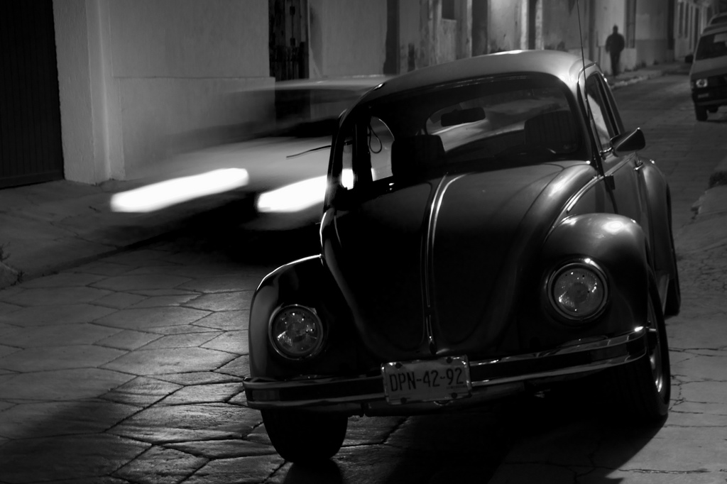
Taken on 22nd July, 2009 in Barrio Del Cerrillo, San Cristobal de Las Casas, Chiapas, Mexico. Nikon D90, Exposure 0.3s at f/5.0, Focal Length 42mm, ISO Speed 200. Show on Flickr.

DPN-42-92.

alternative crop

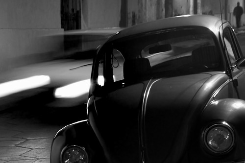
I'm getting obsessive about cropping and post-production. I started once again by wondering if the above may be a more interesting crop.

Instead of posting another series of alternative crops though, I thought it might be thought-provoking to explore a more collaborative approach.

alternative crop

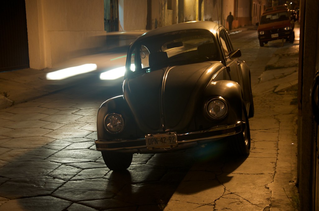
I am posting the original image here, straight from my camera, before I adjusted the white balance and the exposure, before I cropped it, and before I applied a monochrome mix filter. I have also posted a full resolution version of flickr.

I would like to invite you to apply your own post-production to the image, in whatever way you feel optimises it, and post a link to the result in the comments.

If you're feelin? it, I think this could be a very interesting opportunity to explore the effect of post-production in the current digital age of photography.

My comments are not currently set up to automatically handle and display images but if you post a link I will manually set it up so visitors here can easily view the alternate versions side by side.

In the future I?ll be hoping to explore other collaborative approaches to photography. Thinkin? Day 517 and beyond here : )

10 Comments

Alternative version by PJ Taylor

An attempt to give the image a B&W film photo feel, by increasing contrast and mid-tones.

Second attempt

Alternative version by PJ Taylor

Last one was too bright. This is a bit subtler, with a tighter crop putting the focus almost exclusively on the two vehicles, highlighting the differences between them: one bright, white and speeding, the other sombre, dark and at rest.

Here's my manipulation of the image. Also went for the B&W :)

Alternative version by Ivan Frantar

Reminiscent Psychedelic Chroma:

Alternative version by Catherine O'Regan
  • avatar
  • Oisin wrote:
  • 24th July, 2009

I'm really enjoying these responses.

PJ, the high contrast is very striking and makes the main image above look so dull in comparison! I really like your second crop, and thoughts about focussing on the cars. Perhaps I had been too precious in trying to keep the man in the composition.

That said though I think Ivan's composition, tilted so that the main car is level, cropped wide with a nice amount of space to either side, and with the heavy grain, lends a real cinematic quality to the image. The moving car seems all the more dynamic by being the tilted element, and the character in the background becomes very mysterious indeed!

I was beginning to wonder if all versions would be black and white until Catherine uploaded her "psychedelic" version and that really inspired me to get working on another version myself.

I've adopted some elements from each of the other versions, mind you the vivid colours may be the most obvious. I've also tried out a square crop (and I still have the character in the background).

Day 192 - Version 4

I don't think I ever would have published this image to the blog, except that this kind of discussion gives a good opportunity to experiment.

Oisin's beetle

I selected the beetle using a brush in Mask. Lightened it using curves. Sharpened it using unsharp mask. Inverted the selection and put a motion blur on the background before converting to black and white. What do you think?

  • avatar
  • SomeGuyinBrooklyn wrote:
  • 25th July, 2009

well as long as we're celebrating differences...

alternative image by SomeGuyInBrookyln
  • avatar
  • Oisin wrote:
  • 25th July, 2009

Jonny, very interesting to see your take with the masked motion blur. There's something about the aesthetic that really brings out the vintage feel of the car.

SomeGuyinBrooklyn, this takes the biscuit, hands down. This is classic “why didn't I think of that” territory: ) cheers!

I really like the work that Jonny Pardoe did with the photo. The blur around the car brings an striking attention to it.

  • avatar
  • Michael Higgins wrote:
  • 28th July, 2009
alternative versions by Michael Higgins

I wanted to try something different so I opted for the 'bookmark' template!

Photoshop is a bit alien to me for colour grading so I found it limiting but fun all the same. Along with the washed out look I discovered a useful 'lens correction' tool and shrunk the image in the centre making the car and image appear less wide angle (although the crop ended up losing this effect!).

I need to learn how to use masks/vignettes in Photoshop!