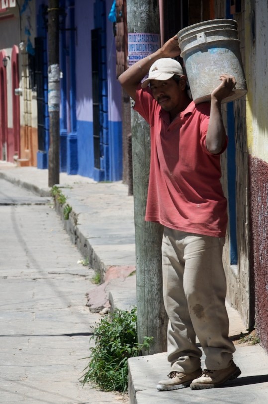
Taken on 18th July, 2009 in La Isla, San Cristobal de Las Casas, Chiapas, Mexico. Nikon D90, Exposure 1/800s at f/5.3, Focal Length 80mm, ISO Speed 200. Show on Flickr.

El Trabajador.

I simply could not stop cropping this photograph. Here's a composition of four crops I tried. I battled between wanting to show the street and wanting to focus on el trabajador.

Do you think I got the balance right in the end?

7 Comments

I'm gonna be controversial and say that I liked the original one the best...the extra depth and colour offered by the wider shot made me hot.

  • avatar
  • Michael Higgins wrote:
  • 22nd July, 2009

yes.

A figure in the distance (in the original) may have justified the wider shot.

  • avatar
  • Oisin wrote:
  • 22nd July, 2009

ooooo controversial indeed Euphioman: )

I'm gonna be diplomatic here and say that yeah I think I would have preferred the wider shot, but only if there had been another element in the background, a figure perhaps, as Michael pointed out.

Without that extra element to add depth, the wider shot felt full of empty space, pretty & colourful perhaps but still empty: )

I like the emptiness, creates tension between an implied sense of desolation and the vibrancy present in the colour palette of the image.

  • avatar
  • Oisin wrote:
  • 23rd July, 2009

I think now that the best crop may have been the second one (see http://bit.ly/tP2xH).

I think I sacrificed too much to make el trabajador the sole focus of attention and lost some nice detail of the street scene.

Live and learn!

  • avatar
  • SomeGuyinBrooklyn wrote:
  • 25th July, 2009

I like the final (fourth) and second crops the best -- overall I prefer keeping some of the focus on worker. In many ways what's lost from the original are details that only extend or elaborate, but not transform the view into a vista. In the second crop, an increased view of the pinkish building creates a pleasing symmetry with the worker's shirt, but somehow the pole's central placement bothers me more in that one than the fourth.

  • avatar
  • SomeGuyinBrooklyn wrote:
  • 25th July, 2009

Wanted to add that the curve of the street is also very nice in #2