Taken on 24th October, 2009 in Granada, Nicaragua. Nikon D90, Exposure 1/40s at f/5.3, Focal Length 62mm, ISO Speed 1600. Show on Flickr.
Clearly defined constraints set the stage for designers to flourish.
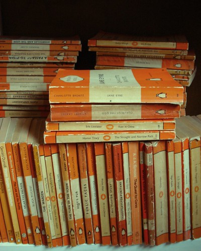
By 1946 Penguin Books had already asserted itself as a design-conscious publisher but Jan Tschichold's systematic approach was to redefine book design.
The enduring principles of Penguin?s design were defined by Allen Lane when he founded the company in the mid-1930s, but it was not until the late 1940s that it adopted a disciplined and coherent approach to design under Jan Tschichold. Already established as an eminent writer on typography and a famous practitioner by the time he arrived at Penguin in 1946, Tschichold was more assertive at imposing his design philosophy than his predecessors..
Tschichold meticulously applied typographic principles to refine and unify the Penguin style. He created a rigid design template, outlined in a booklet of Composition Rules, which established strict style guidelines to be followed for all publications.
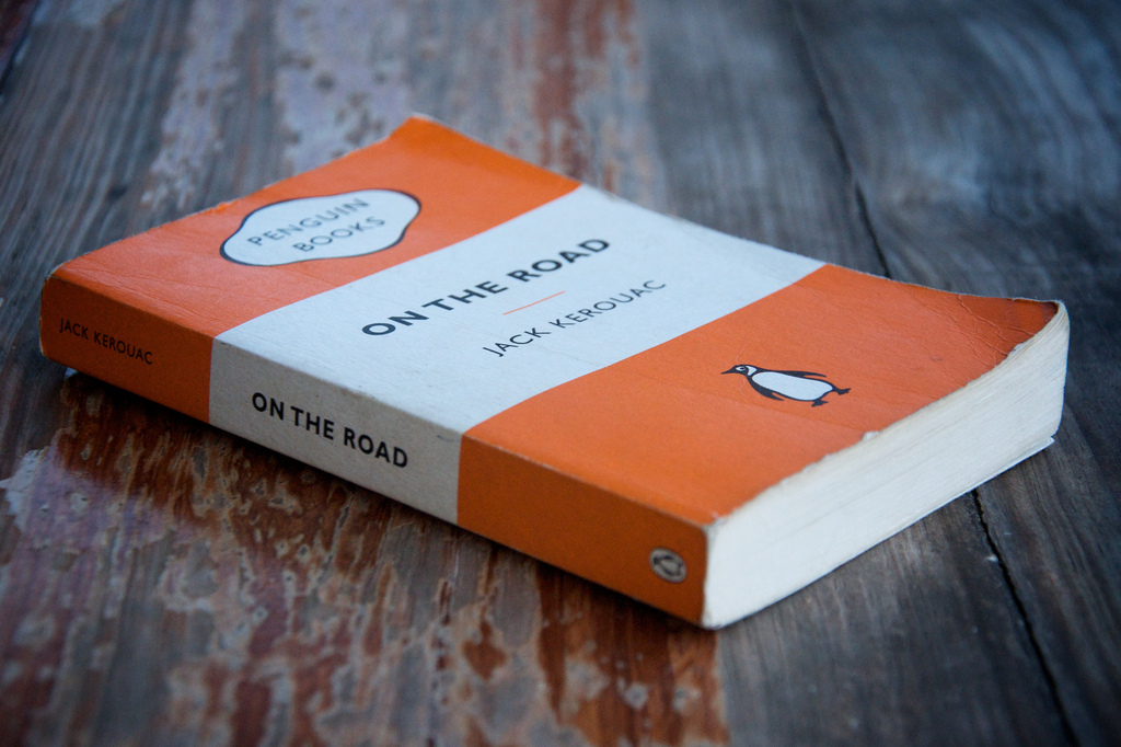
My edition of Kerouac's On The Road, photographed above, is a reissue as part of the Popular Penguins series of 2008, designed in adherence with Tschichold's instructions. The cover is the same format and printed on the same card stock as the early colour-coded Penguins.

The full potential of this kind of systematic approach came to fruition in later series, when designers were given leeway to produce artwork relevant to the themes and mood of the individual works, while still keeping to rigid layout constraints.
For Penguin Modern Poets Germano Facetti commissioned a series of photograms by Peter Barrett, Roger Mayne and Alan Spain between 1962 and 1965.
Here, under the Pelican Books imprint, the consistent use of the title grid prepares the way for illustration to take centre-stage. See Ministry of Type: Constructing The Grid.
More recently, illustrator M.S. Corley playfully reimagined a couple of popular series in the Penguin Classics vein.
M.S. Corley's redesigns of the Harry Potter and Lemony Snicket series were very well received online.
At its best, web design today is comparable to Tschichold's work at Penguin in the late 40s. Skilled designers leverage increasingly capable technologies (and an inversely proportional array of hacks) as they apply both established and innovative principles to construct templates which non-designers can effortlessly fill with content.
Generally the role of designer finishes soon after a site goes live, once any kinks are ironed out. Unlike in print, there is little art direction applied to individual articles or features. The Content Management System rigourously applies the design template to the text, photo, video, and audio content and everything runs (fairly) smoothly. For brochure sites, this can certainly suffice (if the designer has been working with the actual content throughout the process) but where new content is constantly being produced, we have to ask if the capability of design is being fully harnessed.
My edition of On The Road is a work of great design. I enjoy its tactile qualities every time I pick it up, just as I can aesthetically appreciate great web design when I read online. However, the full potential of the relationship between form and content can only be exploited once we start applying custom art direction to that content?because we do judge a book by its cover, a magazine spread by its layout, a blog post by its typeface.
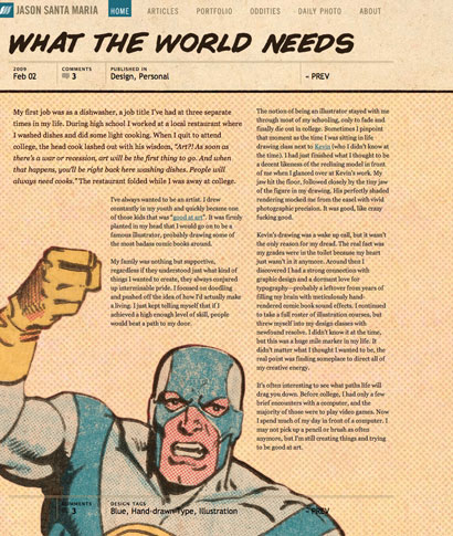
There are exceptional online publications that promote design. Staff illustrator Kevin Cornell at A List Apart provides custom illustrations for each article, which certainly lends a more art directed feel than an accompanying photograph ever seems to do elsewhere.
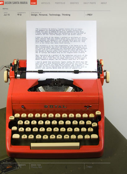
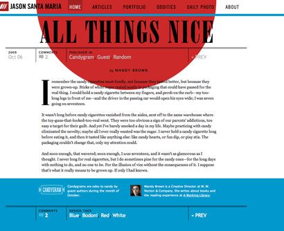
Jason Santa Maria goes further with his personal site, where, within a consistent navigation system, each article is tailor-designed to fit its theme and content. This gives him ample opportunity to flex his design-muscles and illustrates for the rest of us a fuller potential for online design.

If you know of any other sites that pay consistent attention to design I'd love to hear about them in the comments or on twitter.
It's time that art direction and design start to play a continuous role in online publication. Even where a great designer, like Jan Tschichold, has designed the bones of an elegant system, the creative work of illustrators, photographers, designers, and developers, within the constraints of that system, will keep it fresh, relevant, and engaging.

 On This Day in 2009
 Random: Day 362
9 Comments